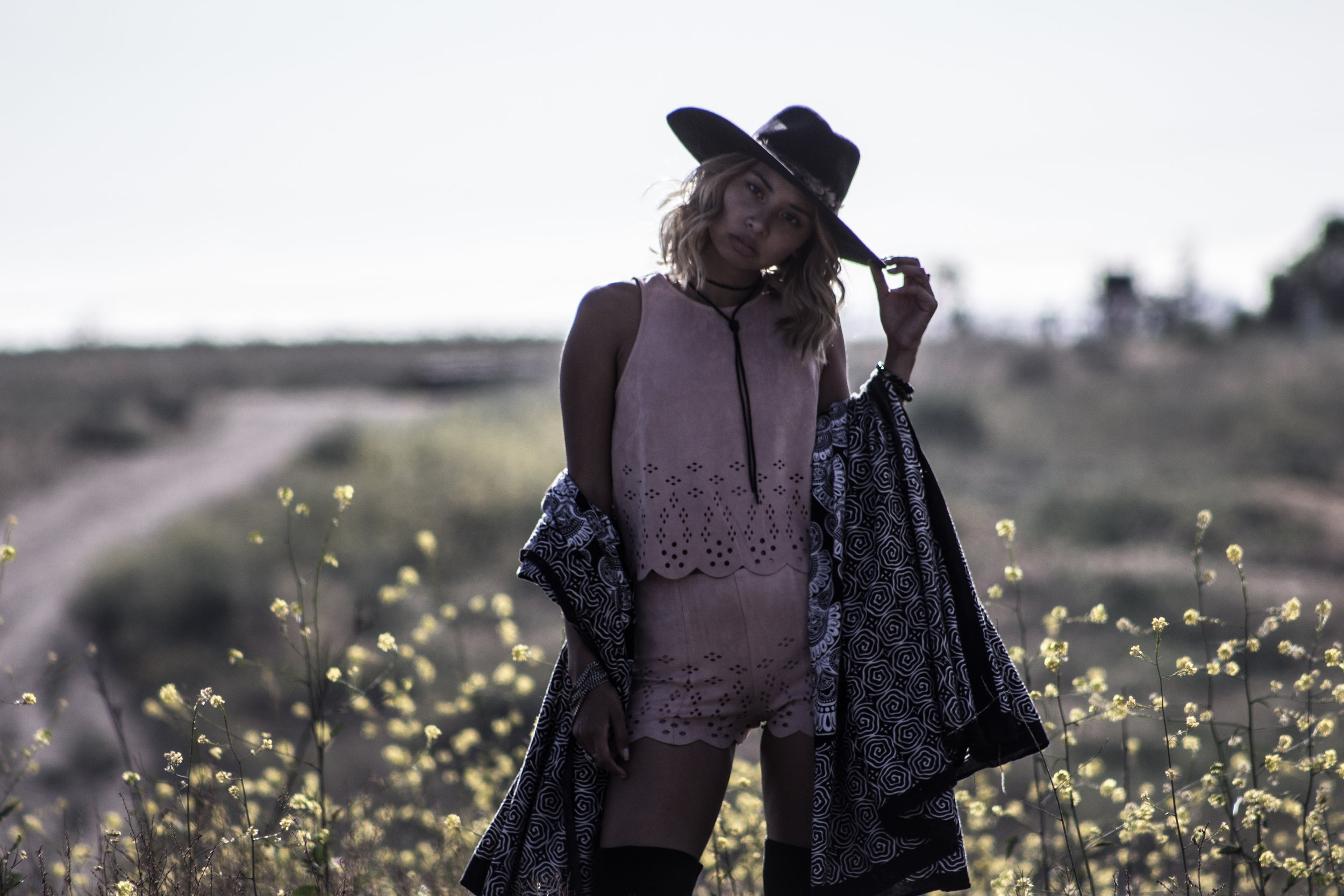
I recently received another question about the composition of my photos for Instagram, and so I decided to do another blog post - this time on negative space. And truth is? I HATE NEGATIVE SPACE. I actually try my best to avoid it as much as I can.
Put simply, negative space is the area between objects in your photos. It can be the floor underneath your flatlay, the wall space in your interior inspo post, or (usually for me) the sky in the background of your wanderlust photo. If you follow my feed @audriestorme, you can see that more often than not, I like to "fill in" all the empty spaces with textural elements like plants, cracks in the floor, fluffy pillows or blankets - anything really! It's not that I'm not appreciative of minimalism in photography (because I am), I just think for me, personally, it does not make for an interesting photo.
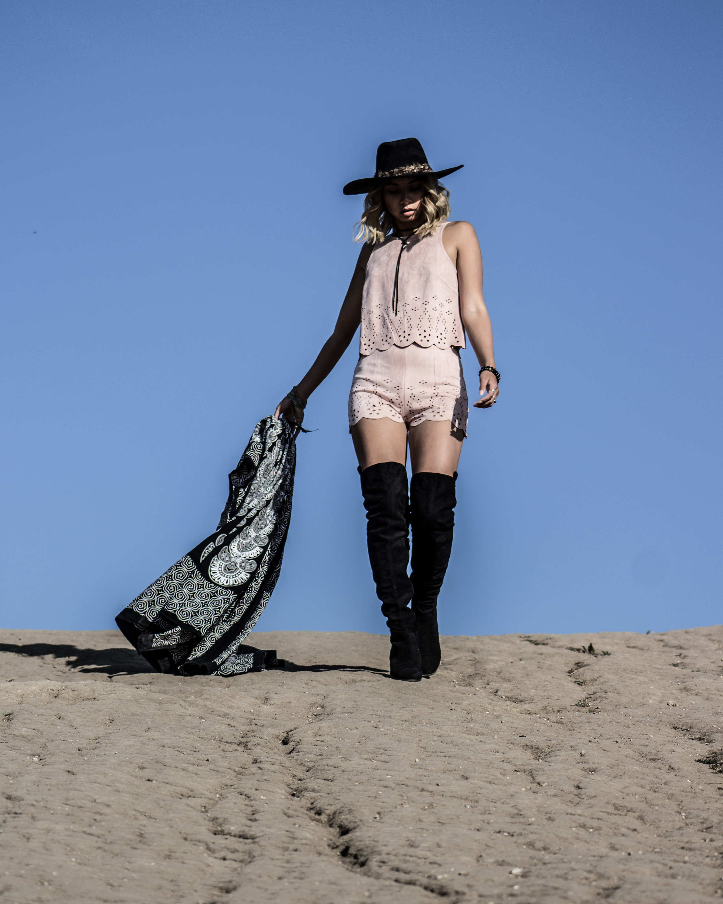
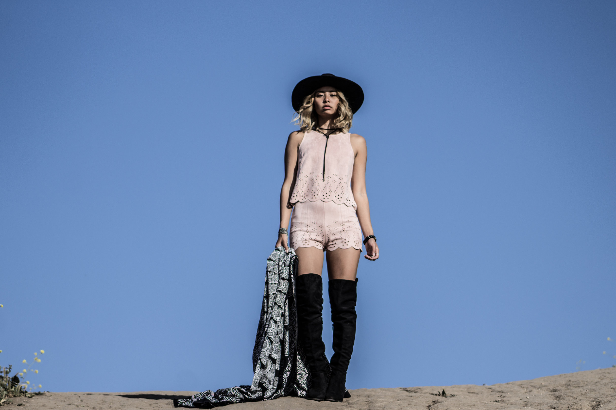
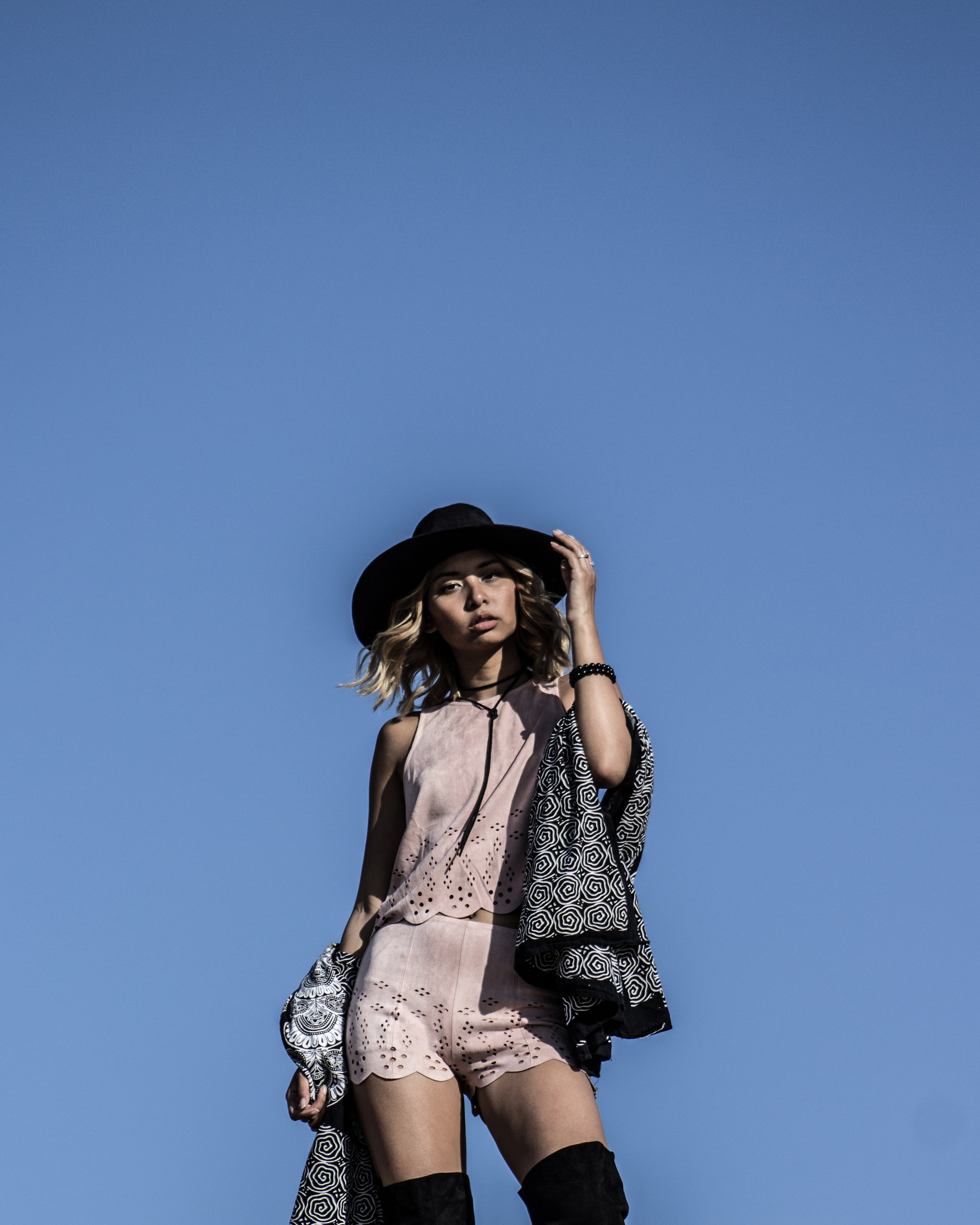
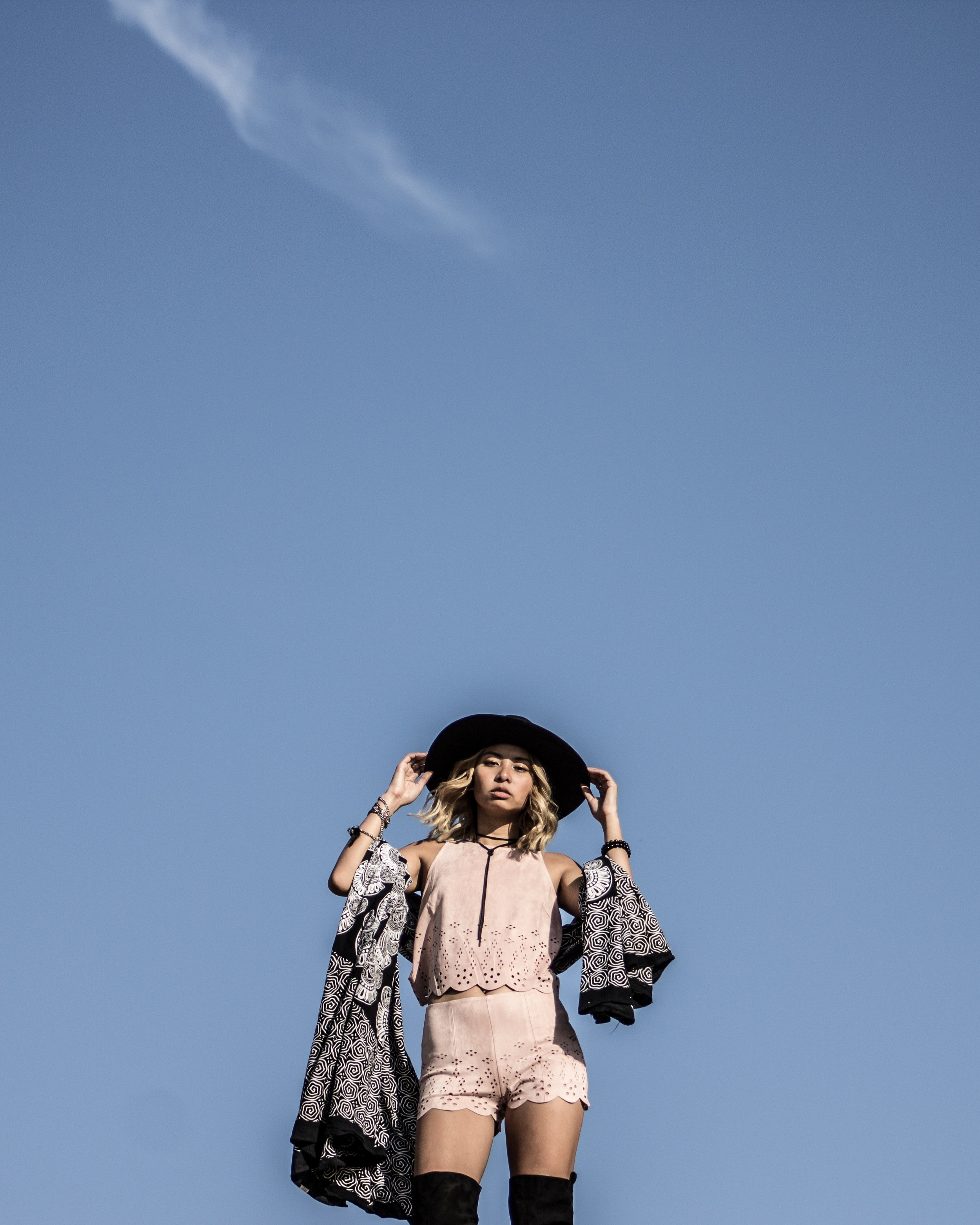
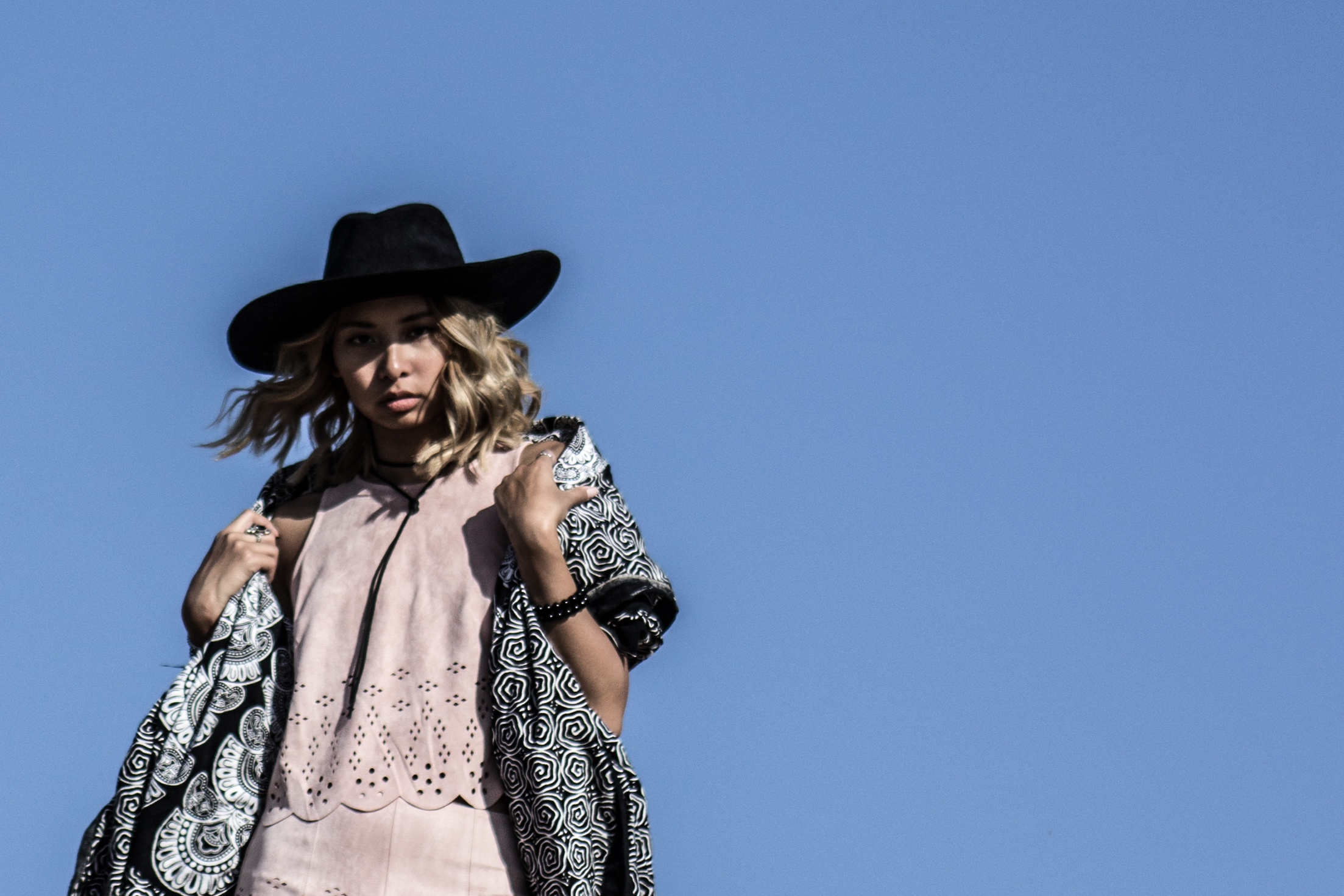
When I think about painting a picture of my life, I think it's messy. Imperfect. Full of things in the way or askew. So I like to demonstrate that in every shot. For example, here is a set of photos that @raleighwilson shot of me with a large amount of negative space (sky):
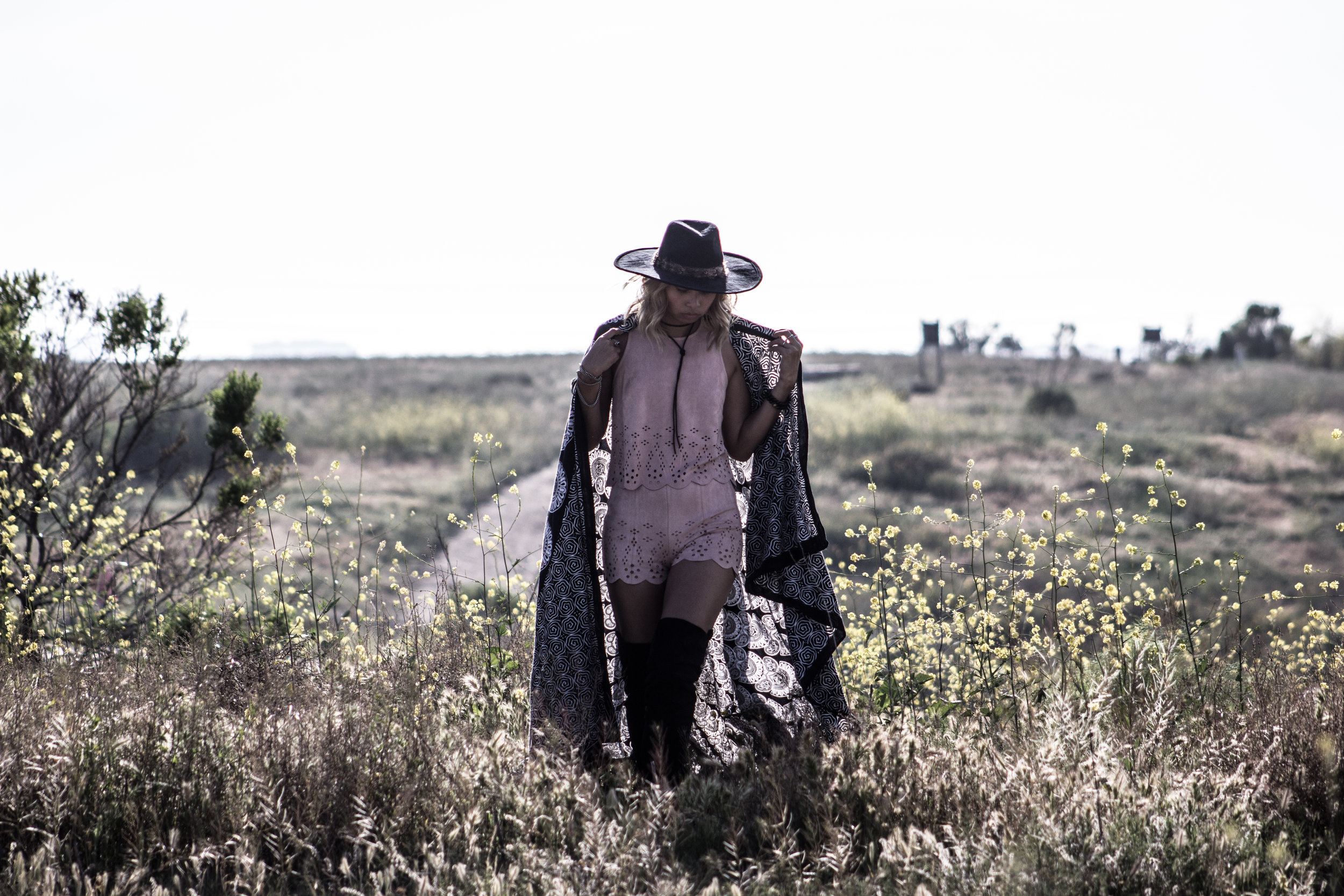
With all of this negative space, there really is nothing to focus on except for me. Not saying that that is a bad thing (especially if that's what I want the focus to be). but for my personal taste, I definitely don't see these photos as more interesting than this set that follows:
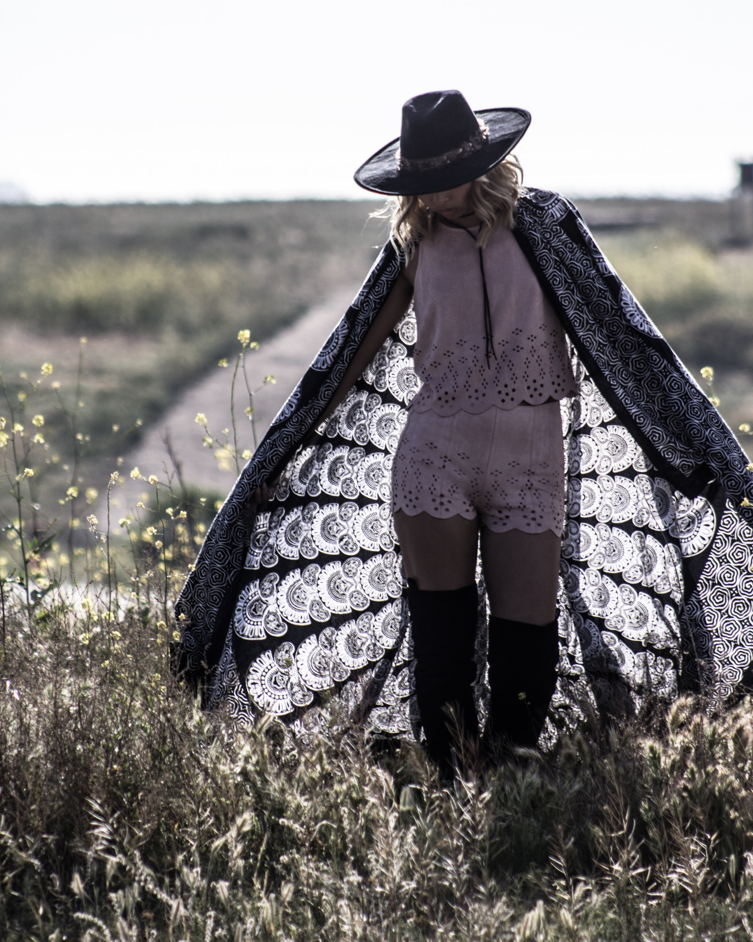
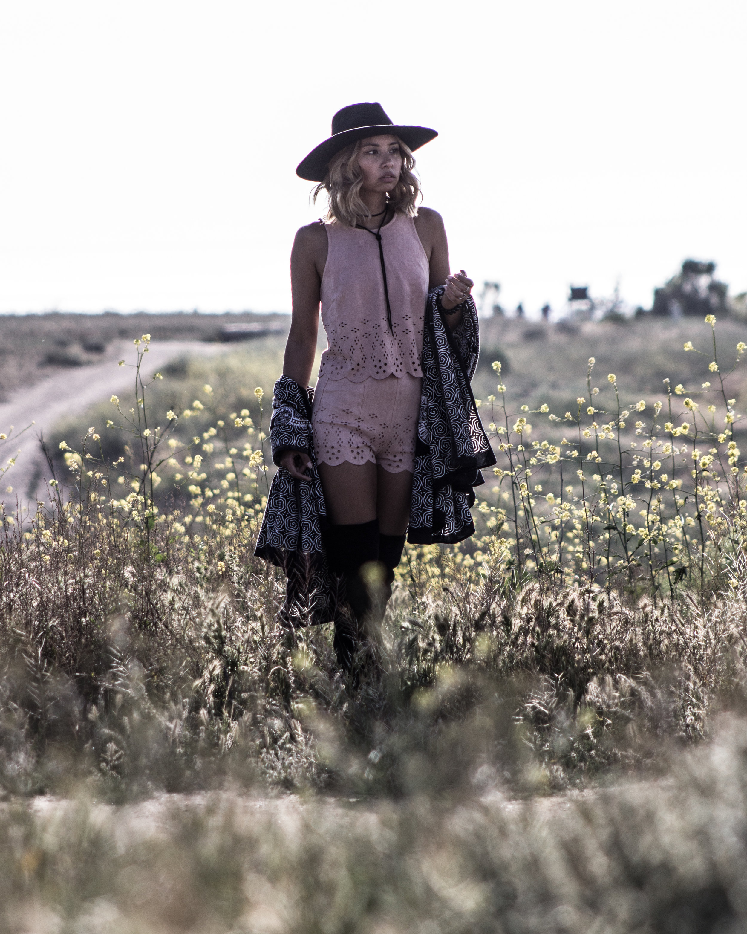
While there is still a bit of negative space, there are other elements in the photos - in and out of focus - that bring together (what I think) is a more realistic set of lifestyle photos. Yes, there is still sky, but with surrounding flowers and field in the backdrop, the whole scene feels more "real" to me in a way that the first set of photos does not.
Hopefully this helped to answer some of your questions, and as always, let me know if you have any more!
xx Audrie
